www.queerearproductions.co.uk
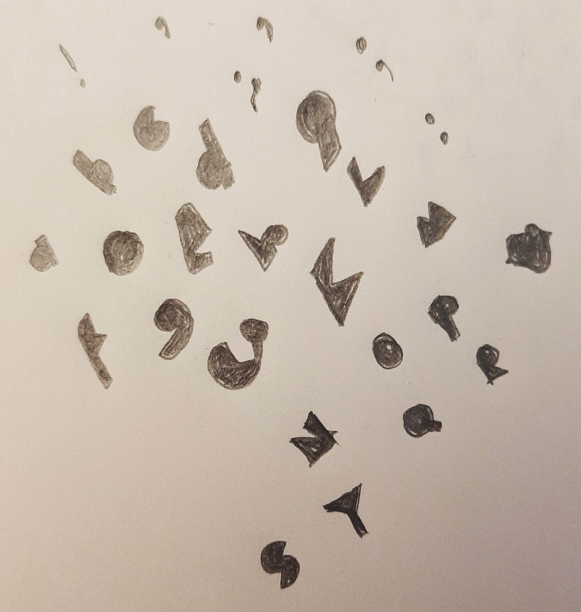
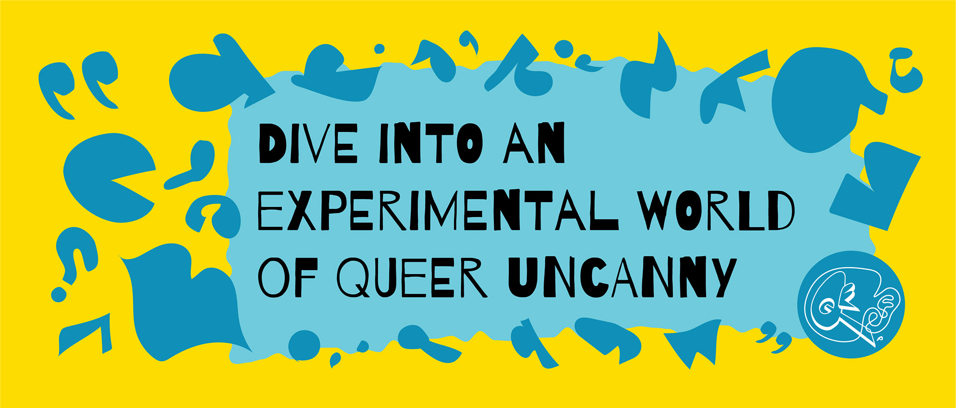
I wanted the pattern to represent the language of the stories so I created an abstract alphabet of letters and punctuation. I matched theis with elements from the rest of the brand to create the colourful pattern.
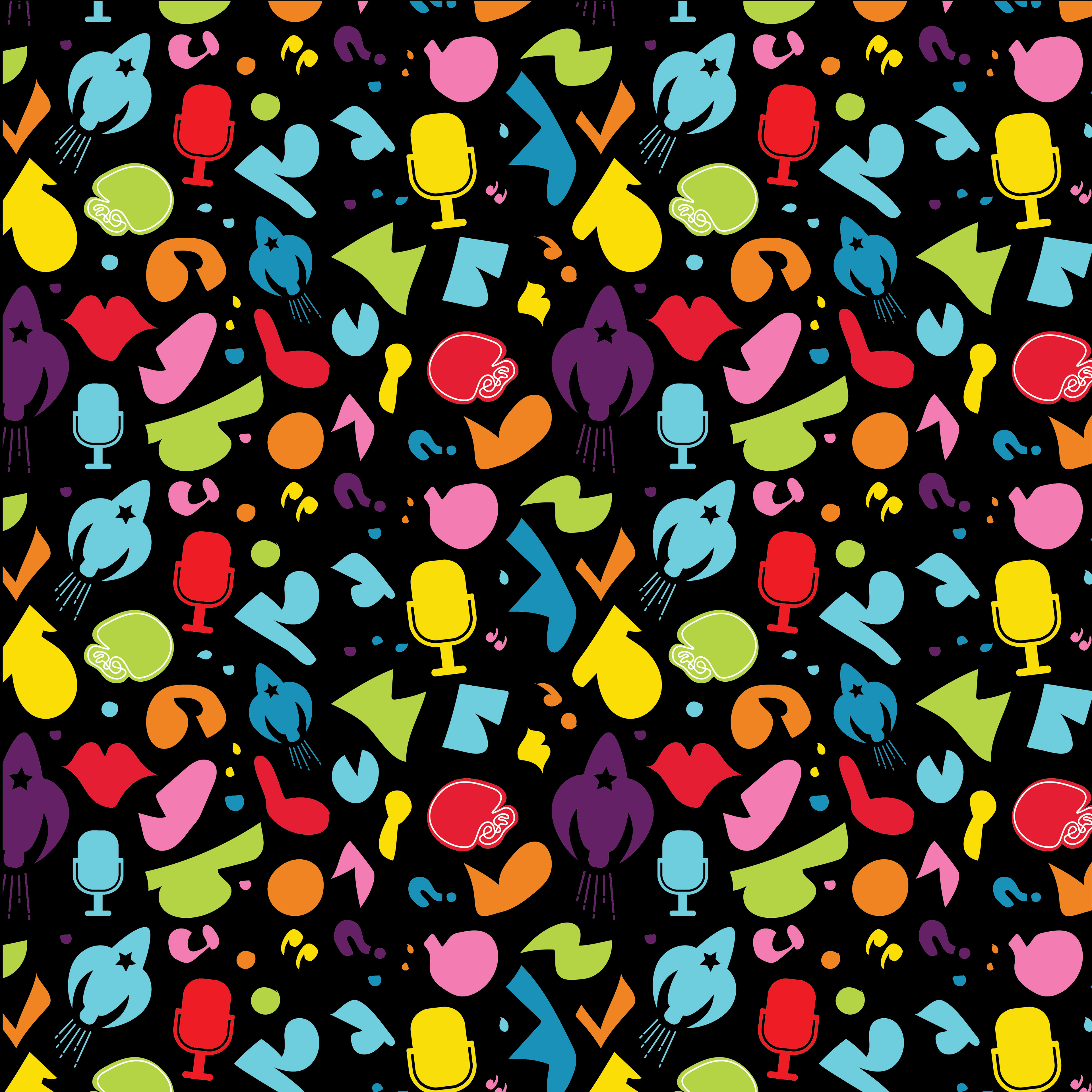
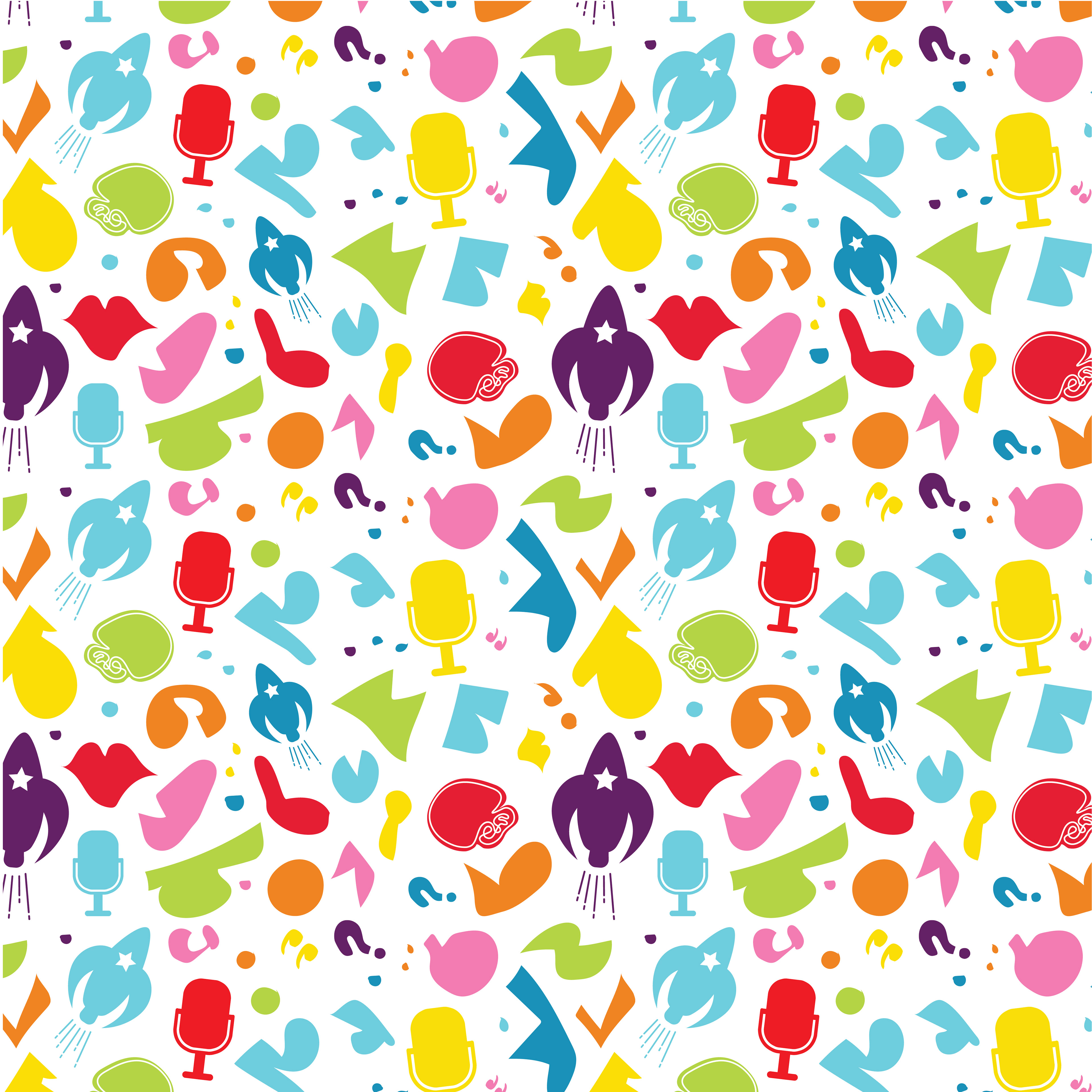
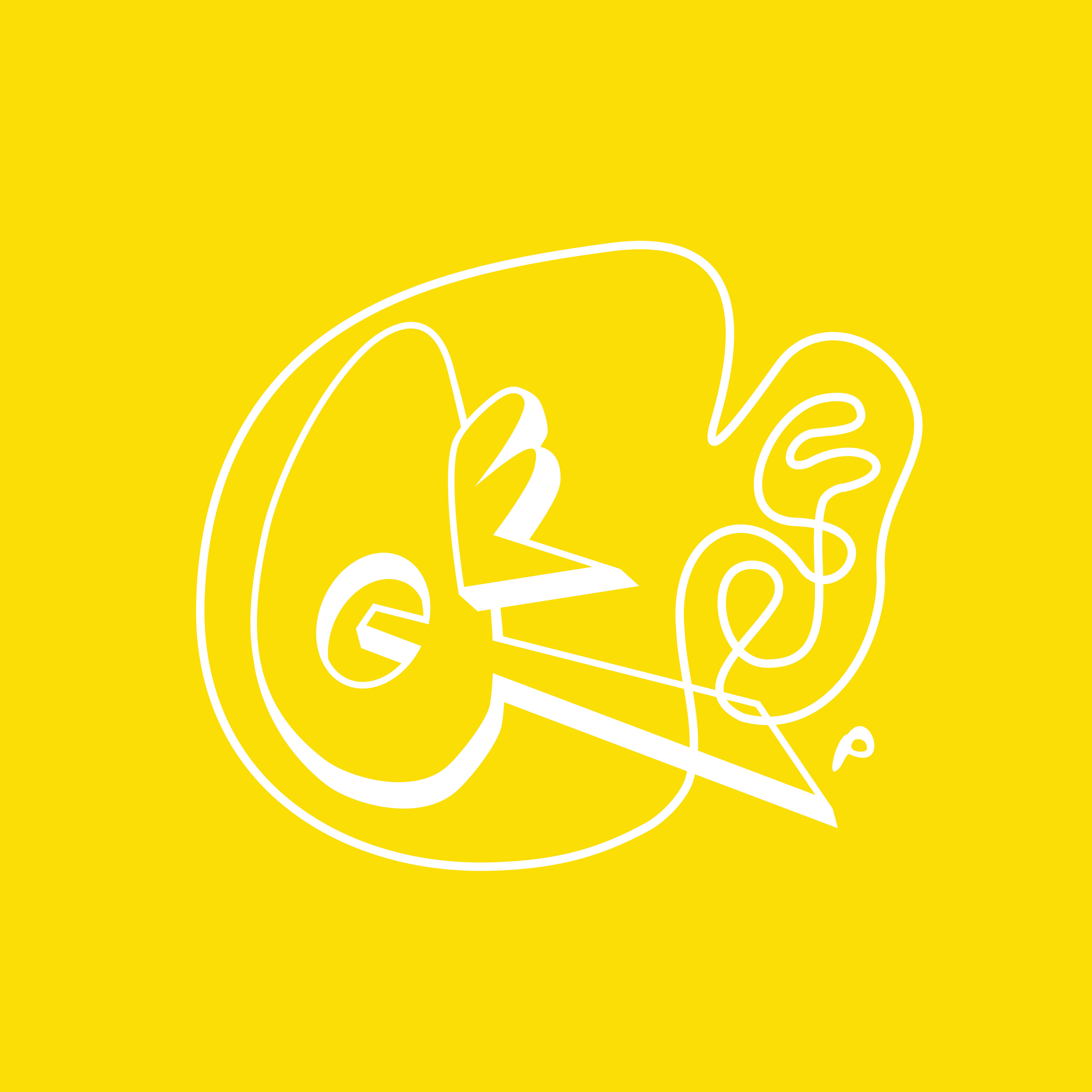
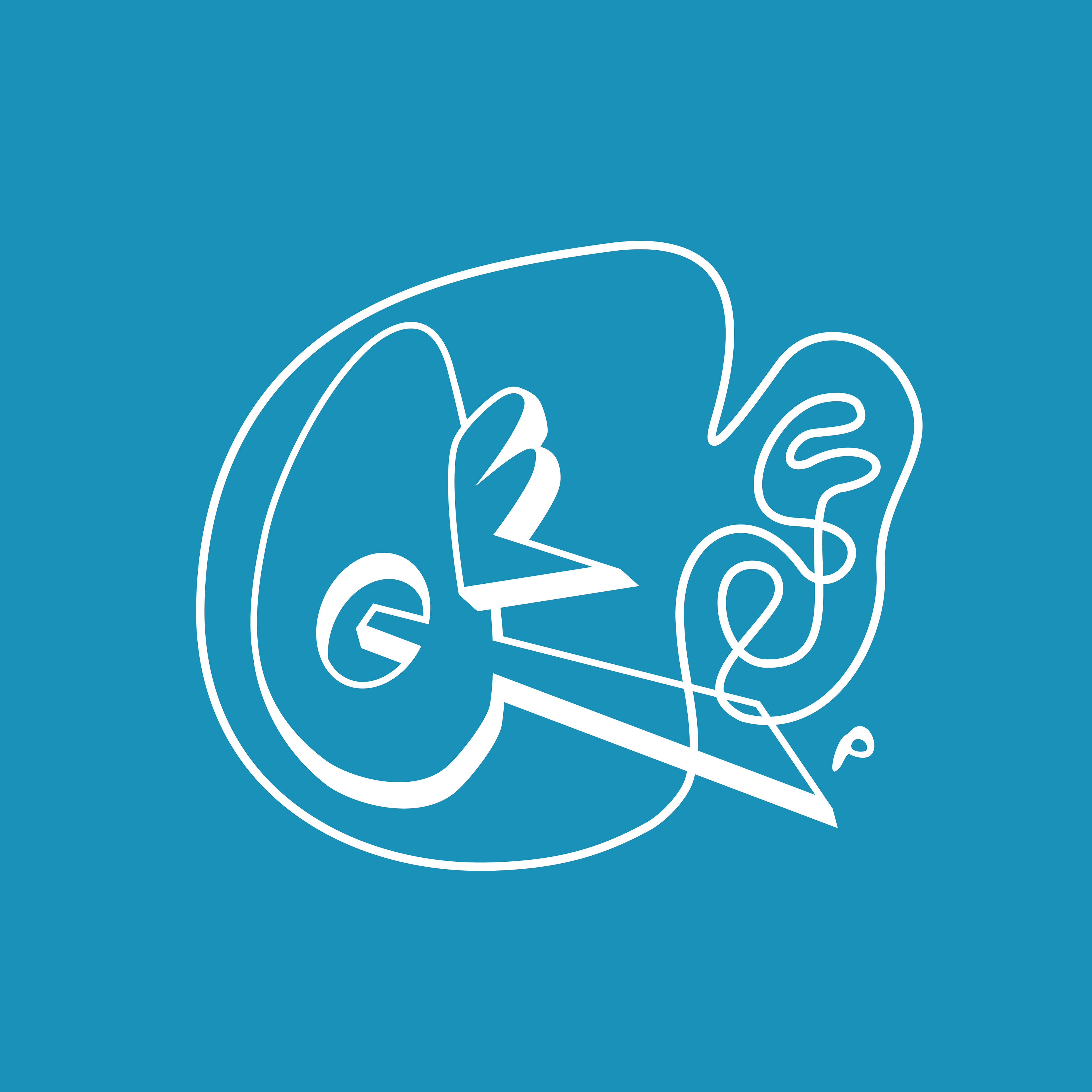
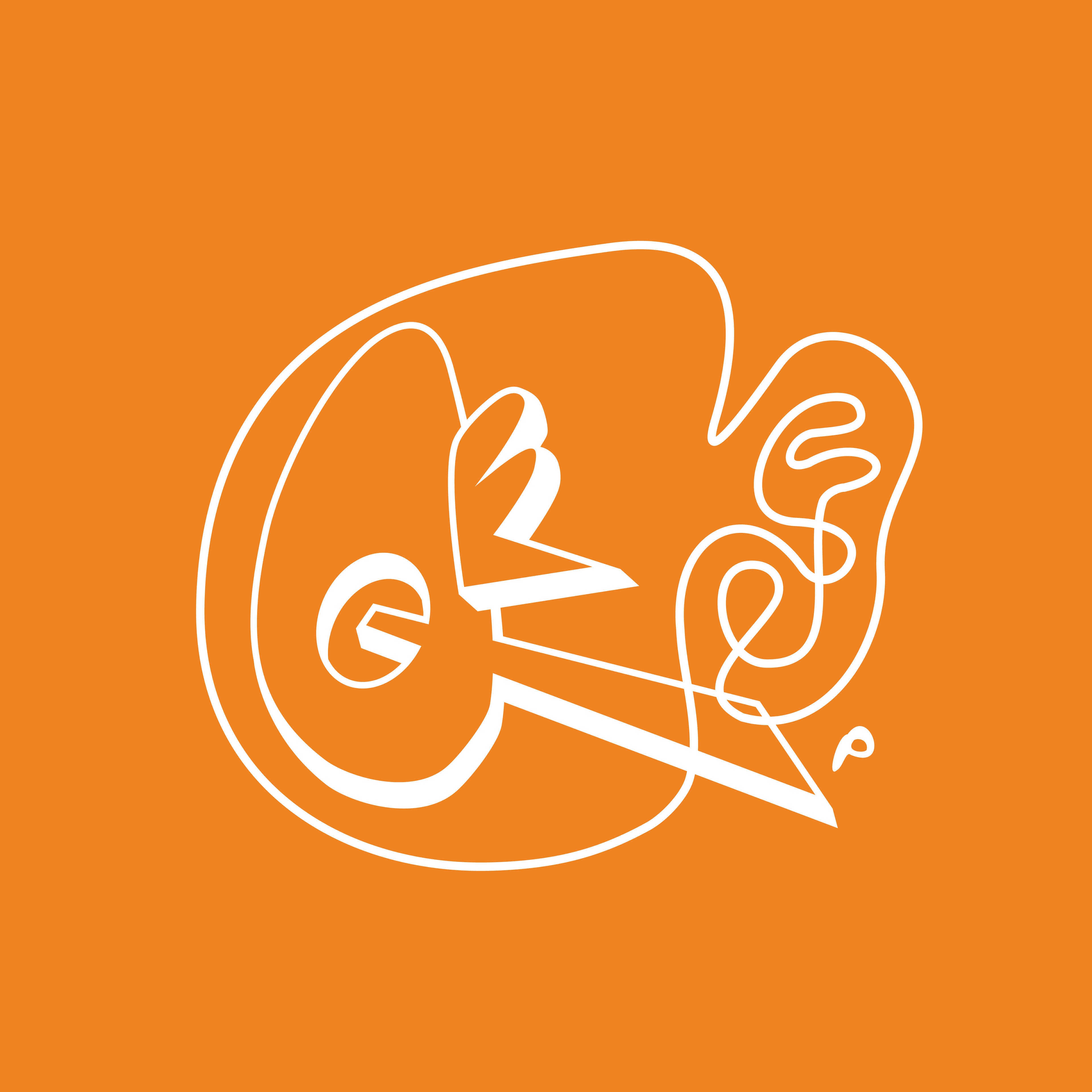
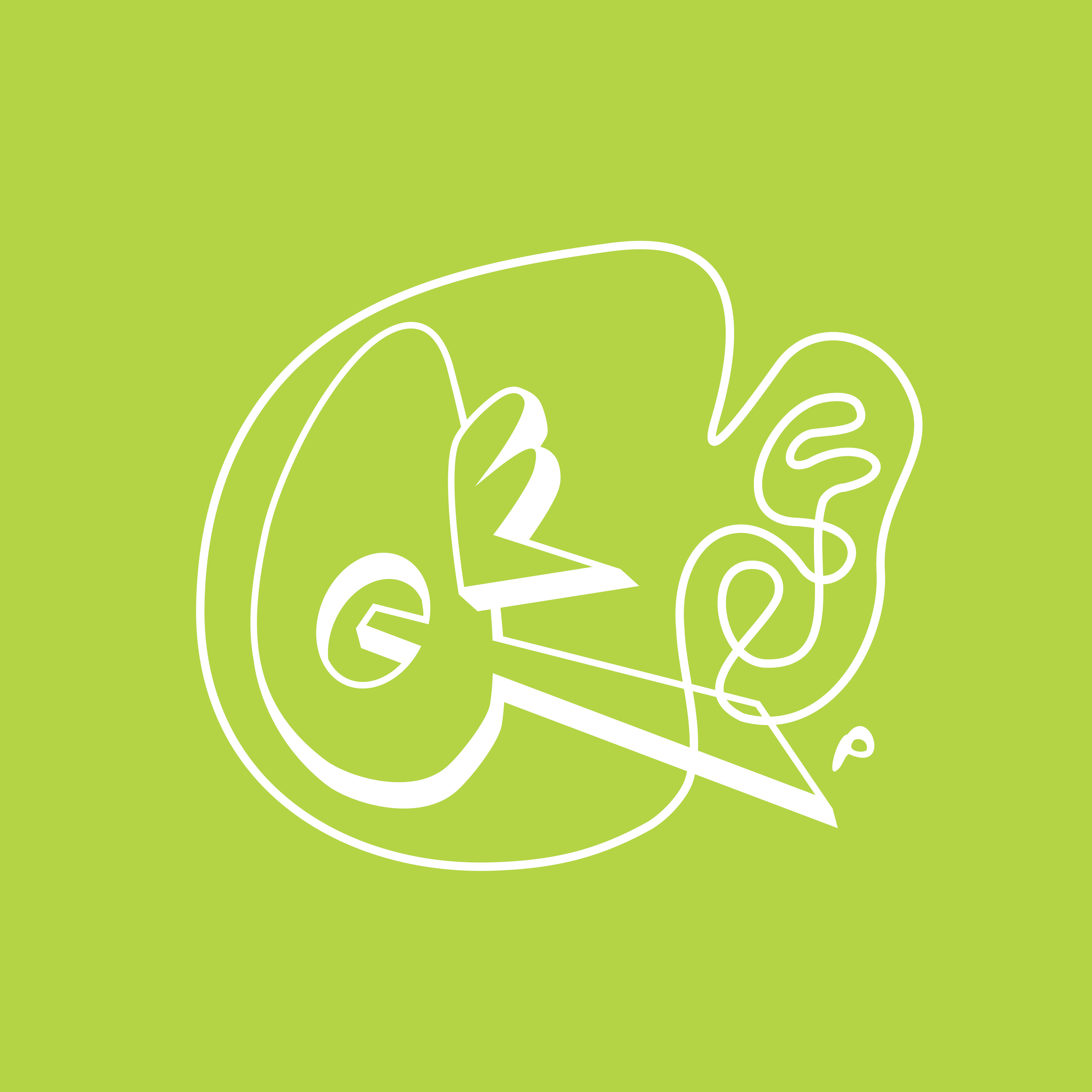
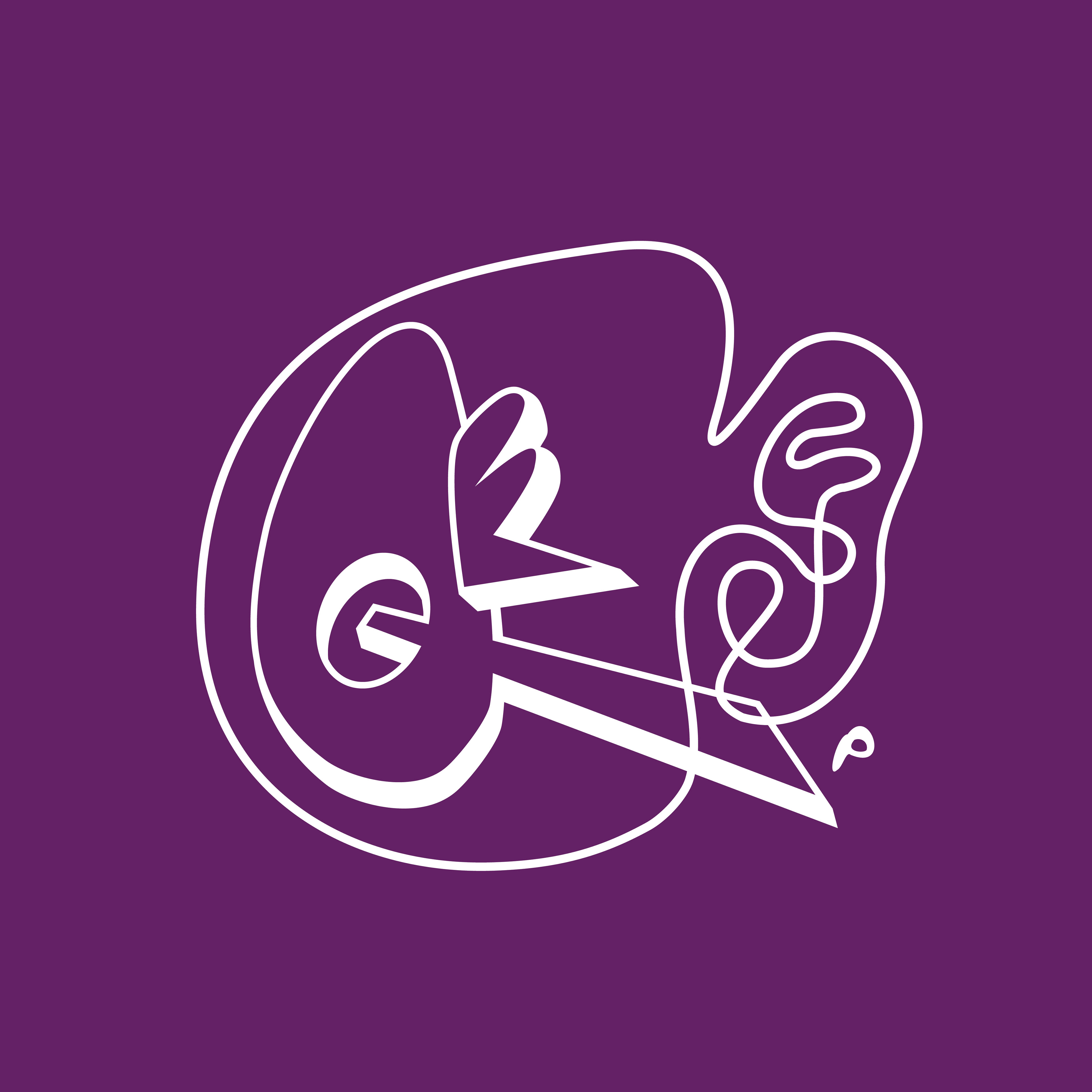
Created using the pattern elements of the Queer Ear Productions pattern and the 'Queer' type from Queer Ear Productions. This
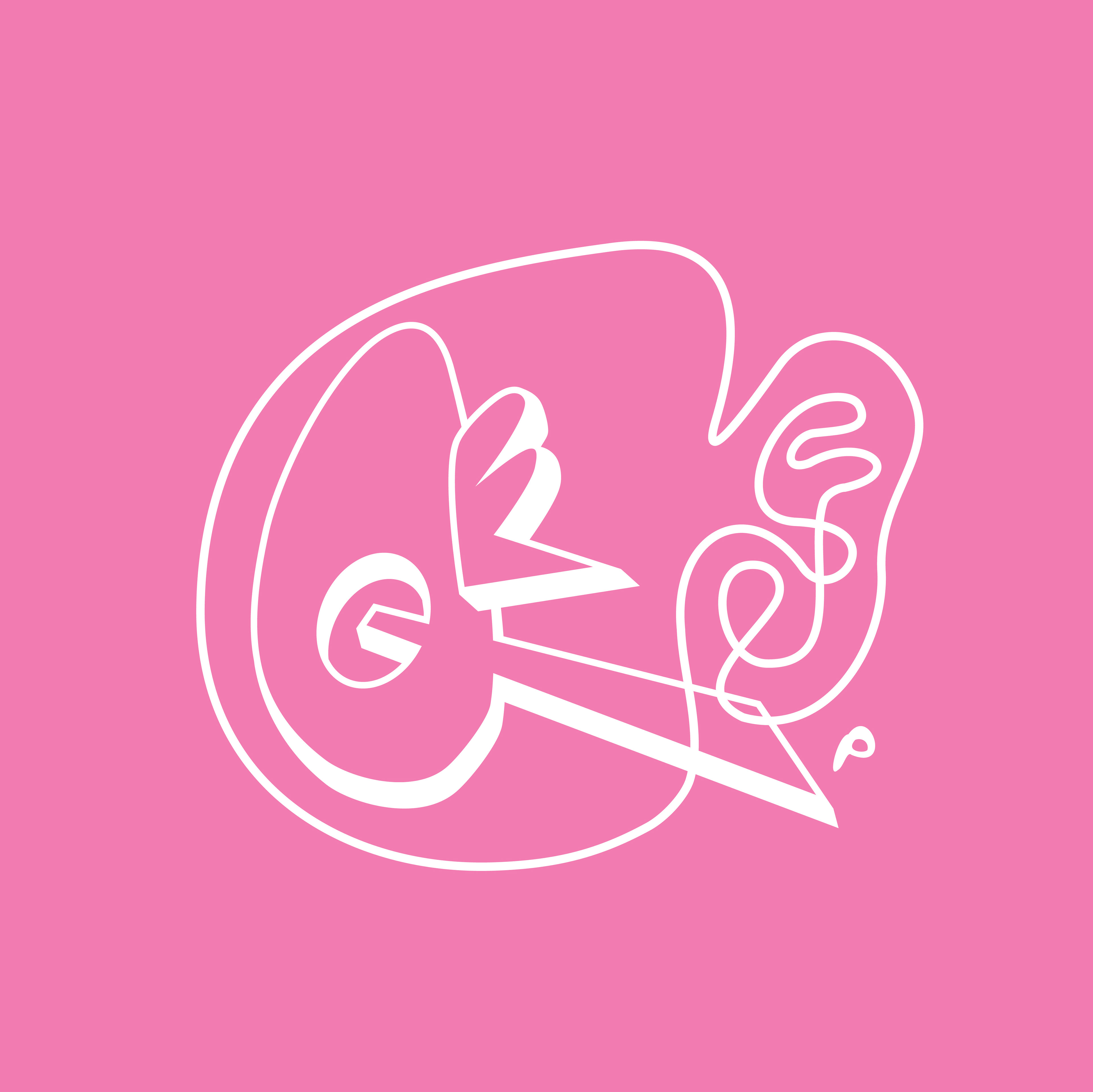
Created using the pattern elements of the Queer Ear Productions pattern and the 'Queer' type from Queer Ear Productions. This
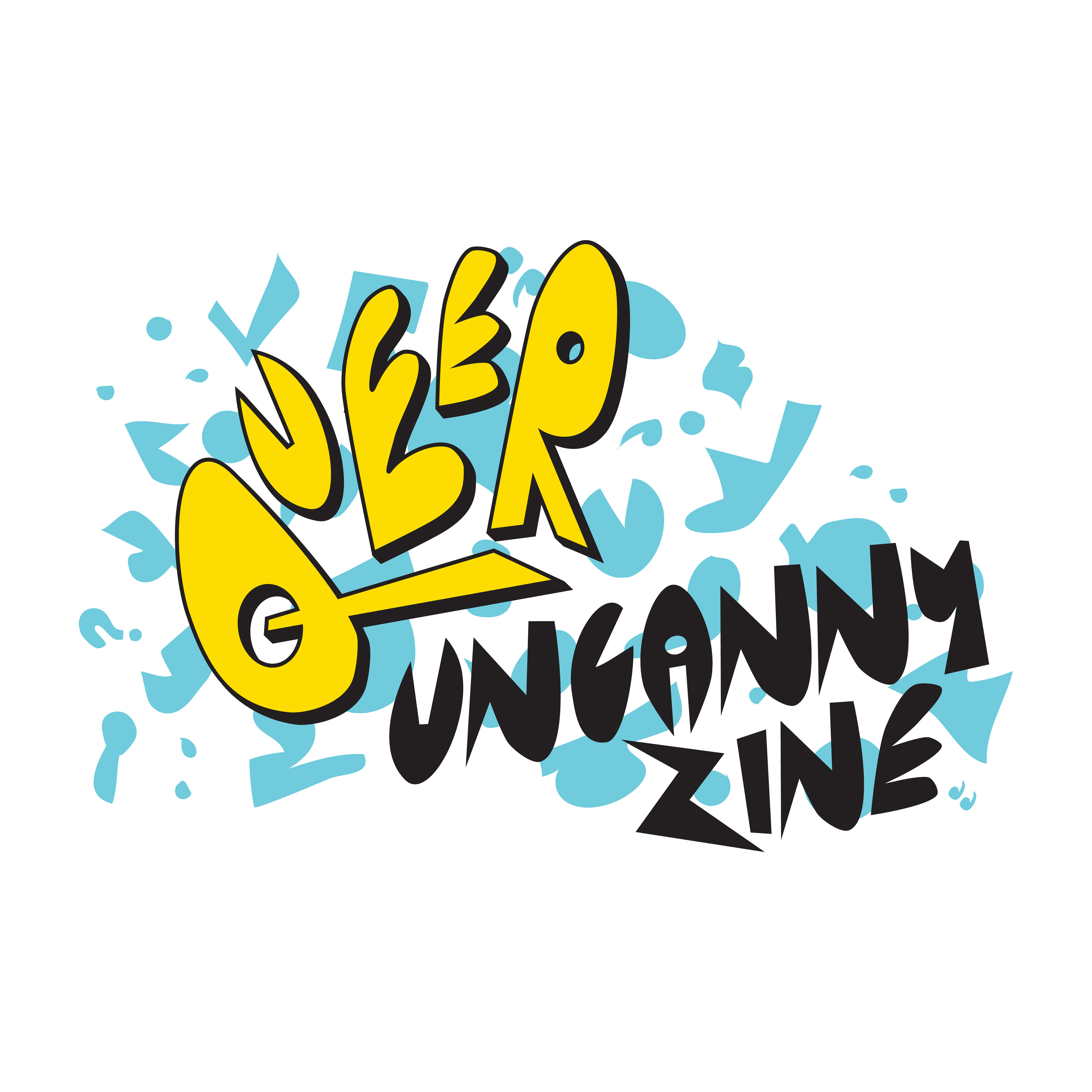
Created using the pattern elements of the Queer Ear Productions pattern and the 'Queer' type from Queer Ear Productions. This
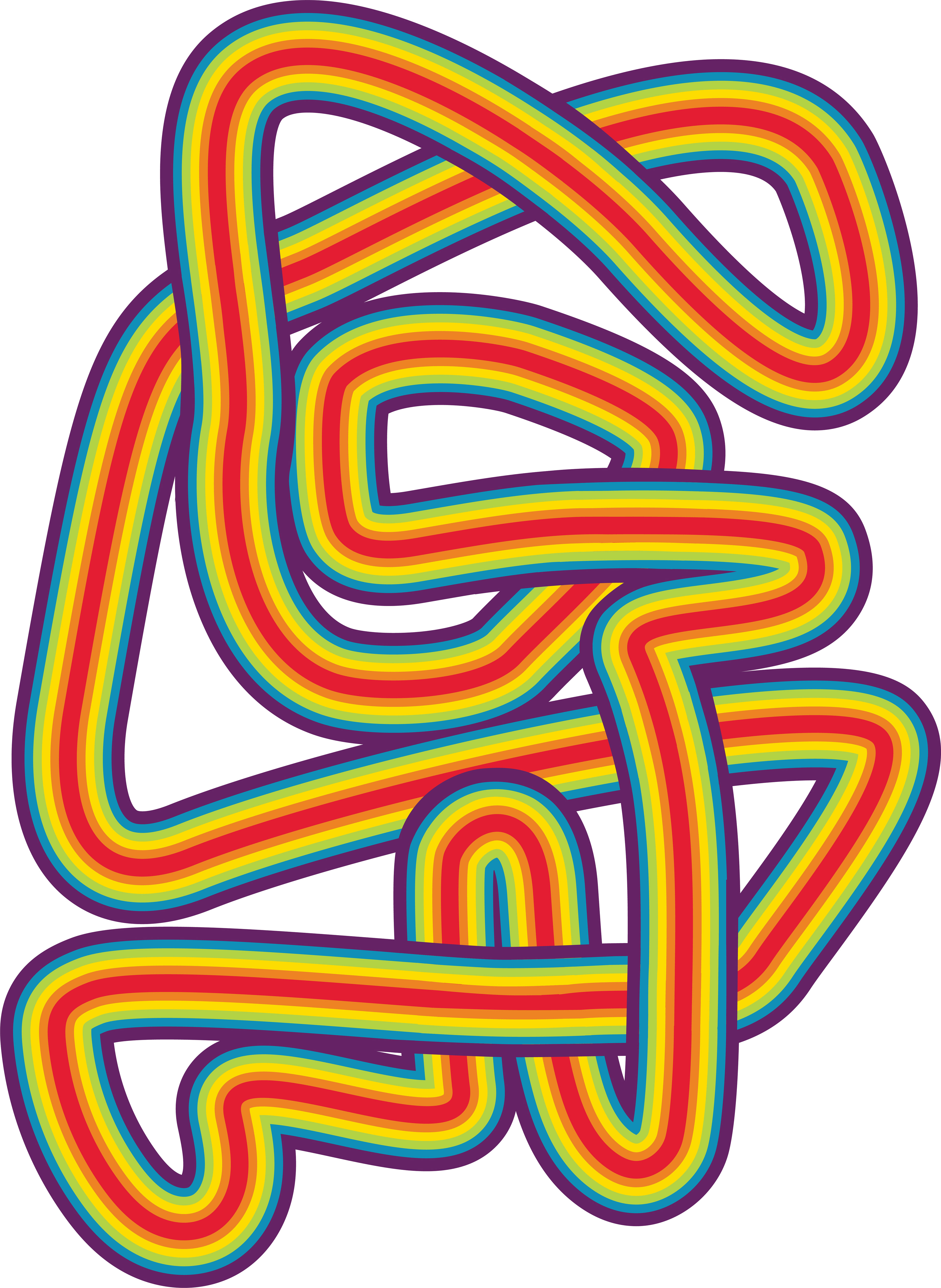
Created using the pattern elements of the Queer Ear Productions pattern and the 'Queer' type from Queer Ear Productions. This
Client: Queer Ear Productions
Objective: To create a cohesive brand identity, including two sub-brands, that reflects the collective’s bold, quirky, and story-driven ethos while appealing to their target audience and working seamlessly across merchandise.
Objective: To create a cohesive brand identity, including two sub-brands, that reflects the collective’s bold, quirky, and story-driven ethos while appealing to their target audience and working seamlessly across merchandise.
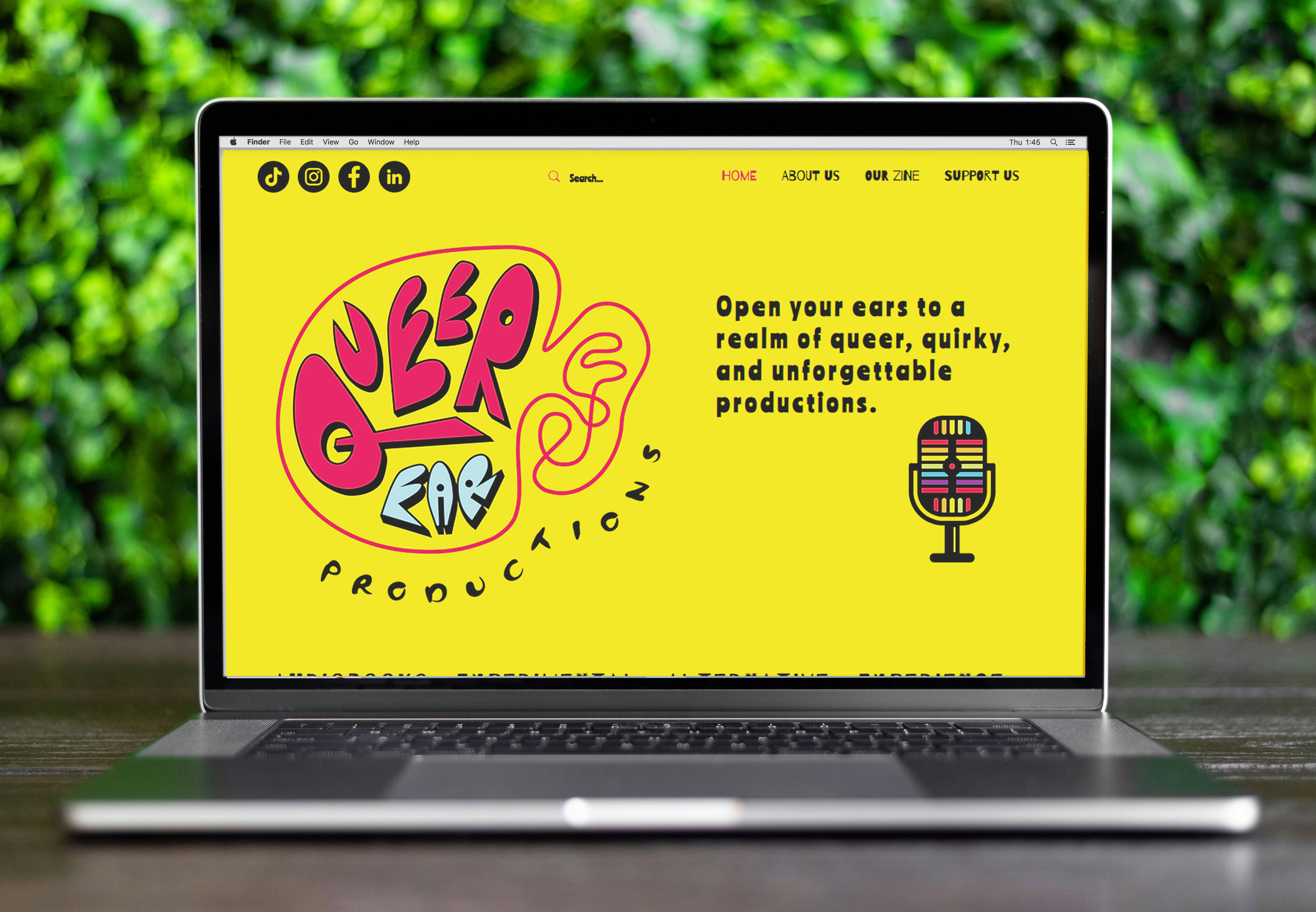
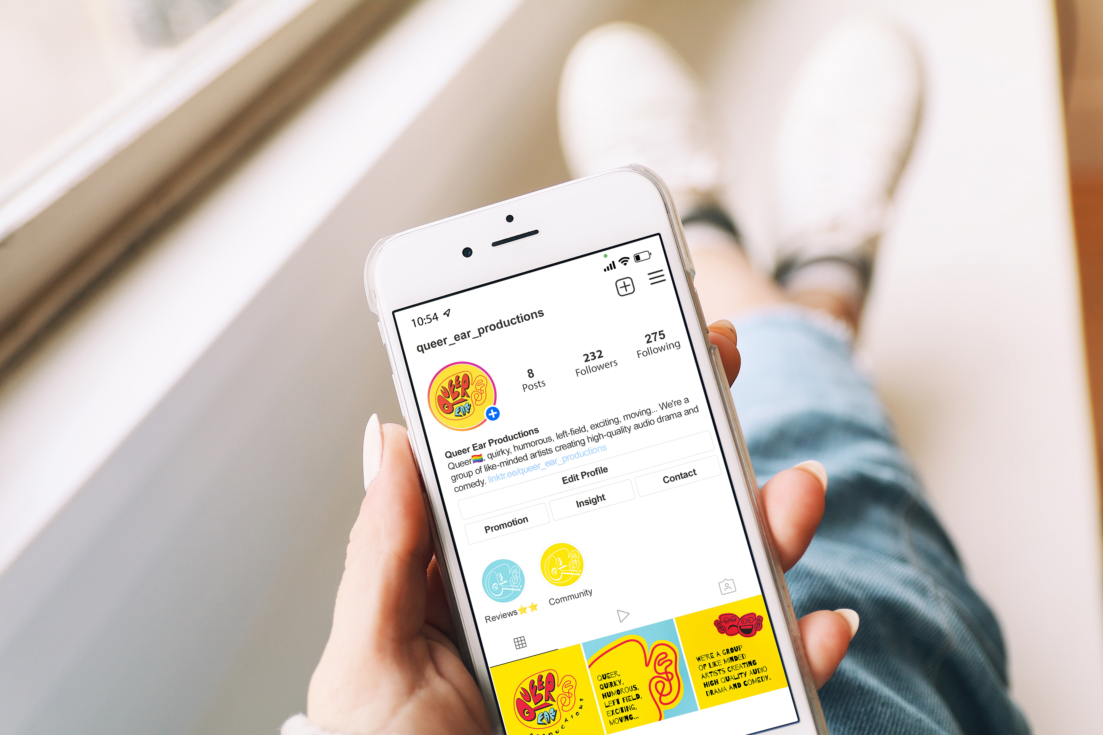
When Queer Ear Productions approached me, they came armed with a detailed brief and a crystal-clear understanding of their brand identity. They knew exactly who they were, what they represented, and who they wanted to reach - a dream scenario for any designer. Their vision was bold, colourful, and playful, with a focus on primary brand colours as a statement. The challenge? To design a main brand identity and two sub-brands that complemented each other while standing out individually.
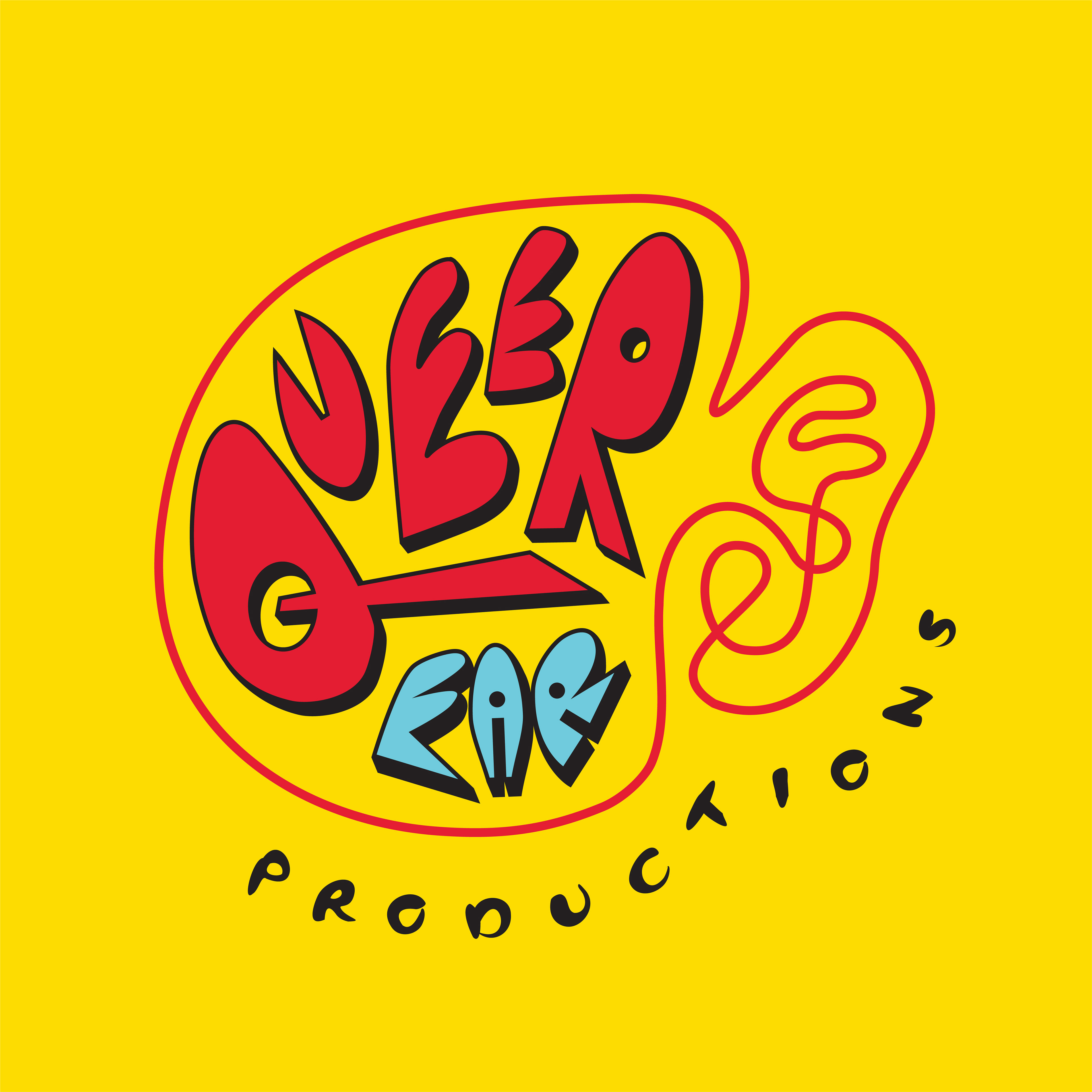
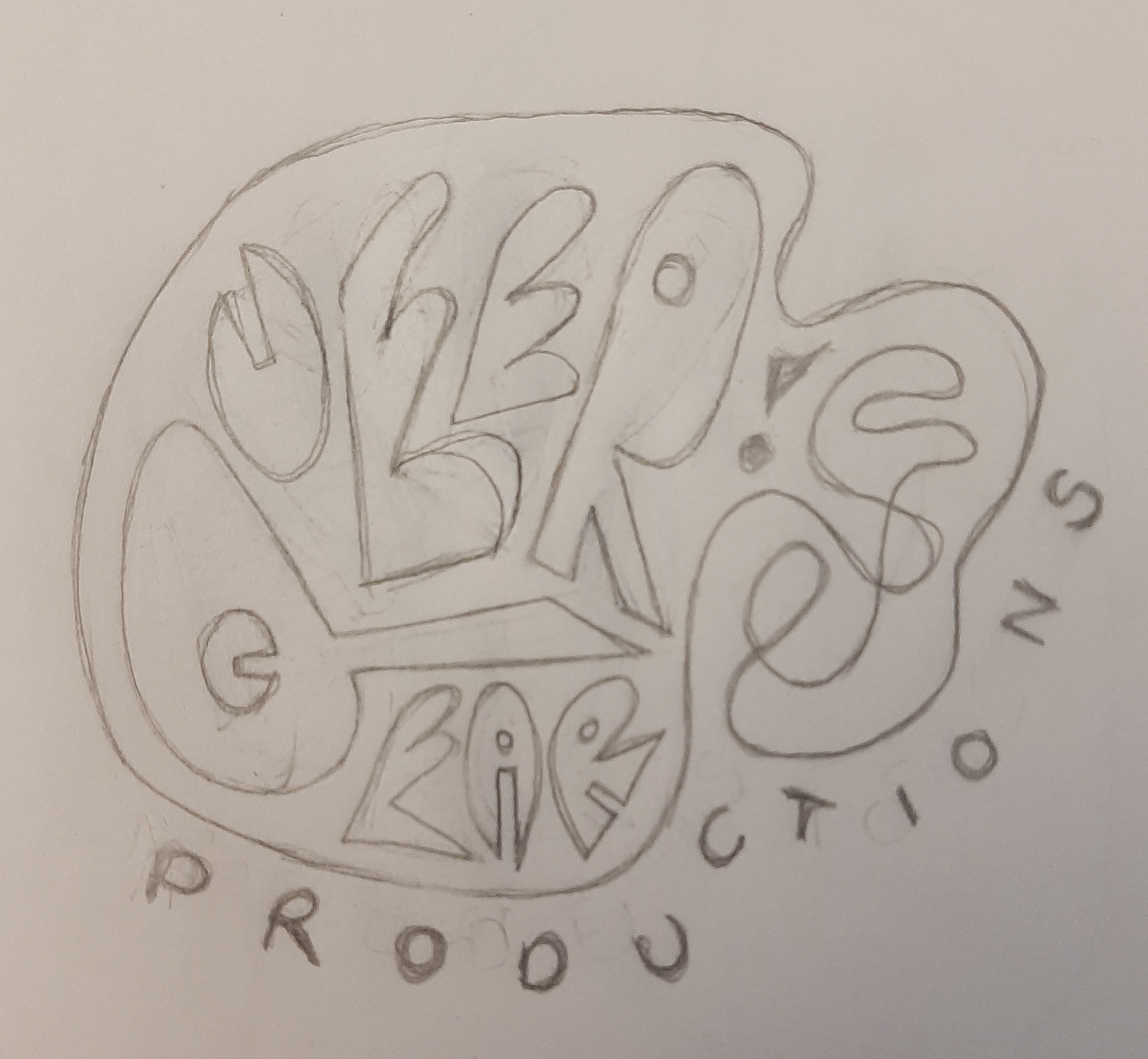
I was inspired by their creative energy. The brief called for something simple yet memorable, eye-catching, and full of personality - qualities that align perfectly with my style. Drawing on the concept of an “ear worm” and a “book worm,” I developed the red squiggly ear logo. This playful element became the foundation of the brand, adaptable enough to represent both drama and comedy through clever visual tweaks to create clever icons.
The result? A vibrant, cohesive identity that was approved on the first round with no revisions - a testament to the clarity of the client’s vision. I just had to inject that personality in to their branding. We created a suite of fun assets and illustrations, ensuring everything from logos to merchandise designs embodied the same bold, colourful spirit.
This project was a joy to work on, not only because of the bold colourful assets I got to create but also because of the opportunity to bring Queer Ear Productions’ vision to life in a way that felt authentic and impactful. The final outcome is one of my personal favourites and I am genuinely excited to see where this creative organisation goes.
Client Feedback: "Katie has been amazing! It's been a great experience and I've loved seeing the branding for Queer Ear Productions come to life! We are a young organization but with Katie I feel reassured that we have a strong future ahead of us."
